

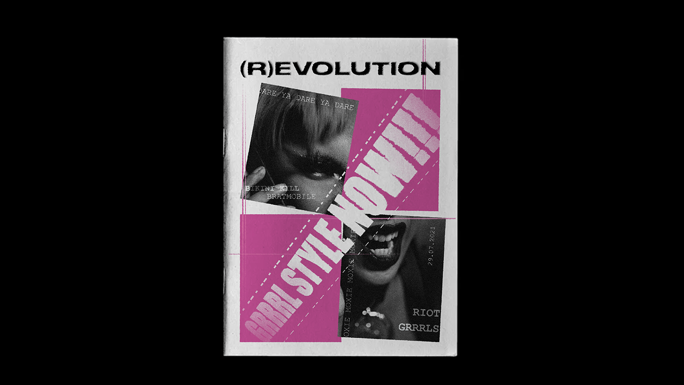
(R)EVOLUTION GRRRL STYLE NOW!
Punk ideology set the groundwork and punk history demonstrated the potential for young people like the riot grrrls to successfully participate in music production and performance, as well as to create and distribute political literature, while simultaneously subverting the mainstream music and publishing industries.
This Magazine discusses what Riot Grrrls was about, their praxis, and the ‘evolution’ of Riot girls that is seen in today’s world.
MOODBOARD


GRID
The magazine uses three column grid since it work well for larger content and allows you to have more flexibility about where content goes.

VISUAL STYLE
The magazine's visual style is inspired by David Carson's grunge style. I have tried to experiment with layouts and typography in the magazine. The ink bleed effect is given to the titles to give the DIY feel to the book.
The book is divided into three parts: the era when the riot grrrls started and how it was formed, their practices which are presented in form of short comics to make heavy topics understandable to young teens too, and how the riot grrrls movement have evolved in today’s time.


TYPOGRAPHY

The typeface is bold and wide. It shows stability and strength thus reflecting the riot grrrls brave movement and how it inspired women to take a stand for themselves inside and outside the punk industry.

The typeface with rounded text gives a similar look to that of typewriter text. Riot Grrrls encouraged zine production which used similar typefaces.


THANK YOU!
Click here to read the Magazine


